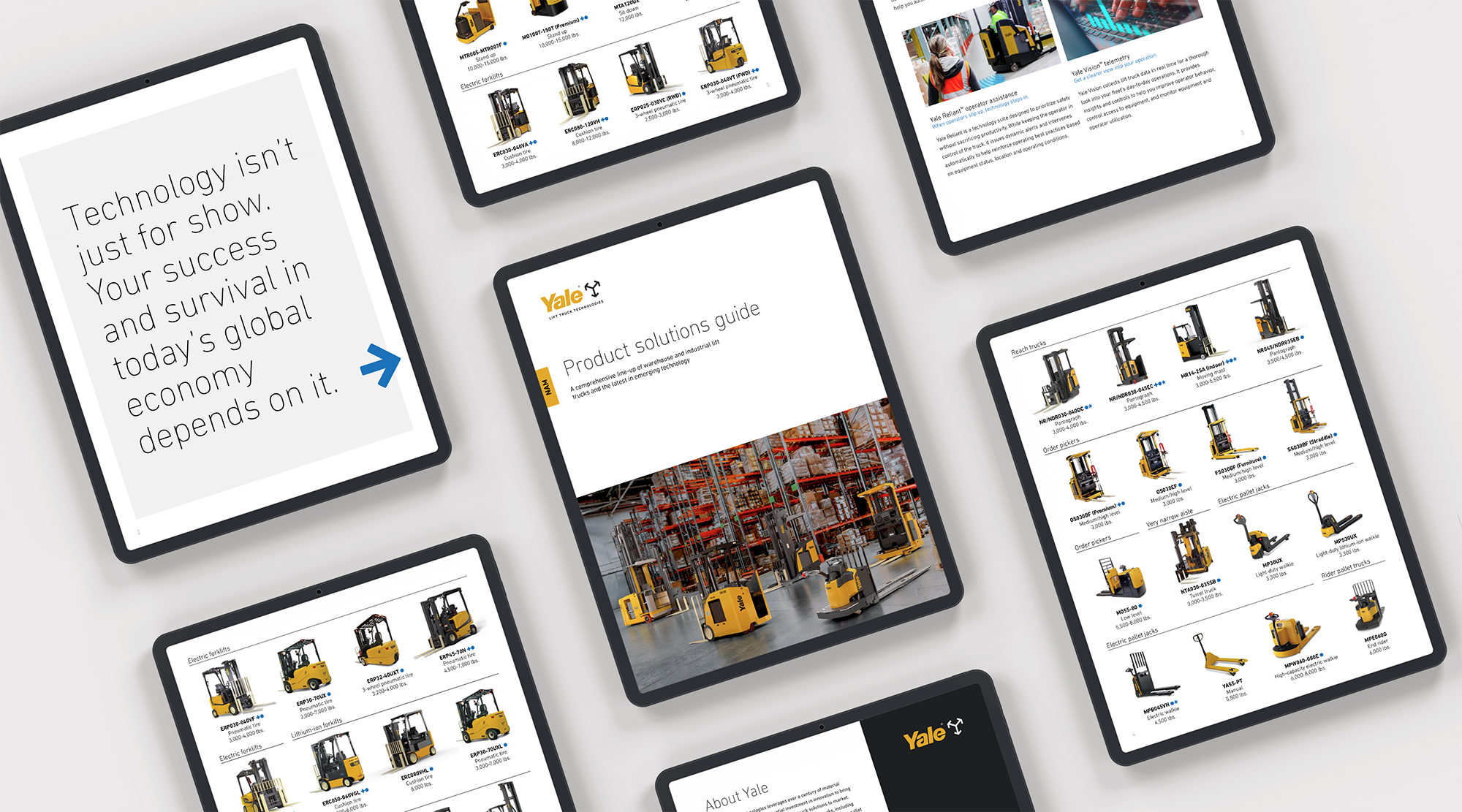
Product solutions guides

Unifying our visual identity while remaining flexible
Our product guides had traditionally been designed independently by each region. While they followed brand guidelines, there were clear inconsistencies when viewed as a collective. As the graphic designer for North America, I was tasked with leading the creation of a new global product guide template, one that would unify our visual identity while remaining flexible for regional adaptation. I also reintroduced and redesigned our global pocket guide, ensuring both versions could be easily accessed and applied worldwide.
This was a solo-led global project. I conducted all research, reached out to key stakeholders across regions, and managed every stage of the design process—from concept development and layout design to determining print specifications and preparing final files for production.
I began by studying how employees and dealers actually used these guides. Were they displayed in offices, referenced during training, or taken to trade shows? Through consultations with team members and dealers, I identified three main insights:
The guides serve primarily as quick-reference tools for employees and sales teams, often displayed in cubicles or shared with new hires.
The existing vendor-based print template, designed with a “print-first” mindset, limited visibility—folds obscured key information and made it difficult to view all content at once.
The physical footprint was too large for office use. I wanted a design that remained functional without overwhelming personal workspaces.


Establishing a new standard for intentional, globally scalable design
Because this was a global initiative, I extended my research to understand regional differences—such as paper sizes, available printing methods, and varying product offerings. Working directly with regional and global product managers, I identified the need for adaptable design variations that preserved brand consistency while respecting market-specific needs.
The final result included two complementary formats:
A digital guide, optimized for quick reference and ease of use across devices.
A compact pocket guide, designed for portability and accessibility at trade shows, offices, and field locations.
Both versions were produced in multiple languages and adapted regionally, ensuring global alignment while supporting local functionality. This project not only streamlined our collateral system but also established a new standard for intentional, globally scalable design. This framework supports how our teams communicate across every region.
Digital guide: optimized for quick reference and ease of use across devices
The digital guide was designed as an interactive resource that allows users to explore products seamlessly. Each product listing links directly to its corresponding regional product page, creating a smooth transition between the guide and the web experience.
To maintain brand cohesion, the visual identity mirrors that of the pocket guide and ensures consistency across all regions and formats. This alignment reinforces our unified design system and provides users with a familiar, intuitive interface no matter where they are located.
The final files are housed within secure, easy-to-navigate internal portals, making them readily accessible to employees and dealers worldwide. This streamlined access supports collaboration, simplifies product education, and strengthens our global brand presence through a consistent, intentional digital experience.
Pocket guide: designed for portability
The pocket guide was designed as a compact, foldable piece that’s easy to carry, display, and reference at events or within office spaces. Its small format makes it ideal for travel, while its layout enhances readability and flow.
This piece reveals its content as it unfolds—an intentional sequence that begins with a technology overview, transitions into detailed technology insights, and concludes with a full product showcase. This structure clearly separates content types while allowing all product information to be viewed at a glance once opened.
To accommodate global needs, the pocket guide is produced in tabloid size for North America and A4 for other regions. The design remains compact yet expandable, ensuring it fits comfortably in hand or within a cubicle without overwhelming the workspace. The result is a versatile, user-friendly piece that reinforces consistency while supporting how teams and dealers engage with our products in real-world settings.


PROFESSIONAL | 2025